
Do you know that the type of fonts that your blog/website uses has a great impact on user experience and readability? The content you have written could be outstanding, sure, but if the font is unreadable, a reader is likely to leave your website and settle for the next present option.
When it comes to presentation, readability is something that matters the most. Not only does it enhance user engagement, but it also leaves the impression of your content being properly researched, structured and genuine. And if you are selling a product/service on your site, you have a good chance of more readers converting and buying your product.
Cutting to the chase, your blog or website isn’t going to last very long if you have a bad font for your content. This ultimately brings us to the next question – what’s the best font for my blog?
This question can’t be answered without understanding the psychology behind using fonts and what causes a difference between them.
Why does the right font matter?
If you are thinking, ‘A font is a font. Why stress so much over it?’ Well, you are right! It shouldn’t matter. You should be allowed to use the font that pleases you.
But when you are starting a new website or already running one, you are writing content for your readers, which means you have to consider every reader out there. The font you are using needs to be readable and understandable to everybody.
Consider the following paragraphs as an example –

Now let’s use a different font for the same paragraph.

Obviously, the first paragraph is more presentable, easy to read and makes your content look professionally-written.
If your blog has a font that is hard to read, doesn’t matter how good your content is, your viewers would likely settle for different options than come back to your website. This is why you need to choose your fonts carefully.
So, how do you choose the right font and what kind of font style would actually complement your blog?
Choosing a font for your blog/website
Choosing a font is easy, as long as you are willing to make it look simple. You might like a particular style of font in drafts, and when you publish your post, it looks completely different. And sometimes, a font looks worse on mobile devices.
Your readers rely on the choices that you make. Whatever type of font you want to use, make sure it’s easy to read, understand and it makes your content look wholesome.
Before I take you on a tour about font styles and the best google fonts, take a note of the fact that the simpler your font is, the better. Sure, there are hundreds of choices available, but most of the fonts don’t appear well on certain devices.
With that said, let me introduce different font options and styles to you.
1. Understanding the different typeface styles
Let’s be clear with this – Fonts and typefaces are very DIFFERENT!
Fonts could generally be described as a style of a particular typeface. However, typefaces are different categories of fonts.
As an example, consider the font ‘Times New Roman’. It is a font. While as Sans Serif is a typeface.
So, what are the different types of typefaces?
Here’s a list of some of the most common typefaces which you’d have to use down the line.
Serif
Serif fonts are widely used. From printing to general notes, these fonts have a traditional look which is easy and simple to read.
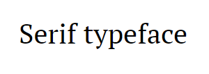
When using this font, you might want to make sure the size of your font is large. The reason for this is because if these fonts are small, it might be hard for some readers to read them. Some of the most common Serif fonts are – Times New Roman, Garamond, Bodoni, Georgia.
Script
Script fonts are the best matches for headings that need to be decorative. Right from valentine’s day cards, to birthdays or similar occasions, these fonts always bring out the best headlines for your cards.
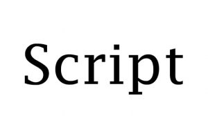
These fonts are beautiful and serve a variety of purposes. You can commonly see them in titles, headings, and subheadings at times.
However, writers usually refrain from using these in the body of the content as they could be hard to read at times.
Some of the common script fonts are – Lobster, Comic Sans, Brush Script, Lucida.
Sans Serif
These fonts don’t have any thin lines at the top or bottom like Serif fonts.
These fonts are clean, simple and could be used throughout the body of the content as well. A lot of bloggers and writers rely on these fonts to make their text readable and presentable.
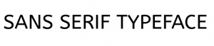
However, all the sans serif fonts aren’t good. You might want to nitpick among these fonts.
Some of the common sans serif fonts are – Calibri, Arial, Verdana, Futura and Century Gothic.
Monospaced
You can recognize a monospaced font by the gap present between the letters. A monospaced text usually has larger spaces between them.

It goes without saying that Monospaced fonts aren’t recommended to be used on websites or blogs because they are usually hard to read. Not only that, but it also makes the text very unpleasant to read.
You can use them in videos or other personal purposes.
Some of the common monospaced fonts are – Courier, Monaco, and Consolas.
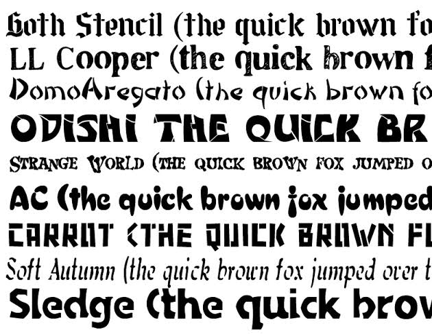
Decorative

There are a variety of decorative fonts that could be used within your content.
All the custom fonts that didn’t make it to the list of typefaces above fall in the category of decorative fonts.
These fonts make your headlines and titles look presentable. But if you are using them throughout the content, you might as well not write the content at all.
They don’t go well as the content of your blog post.
Some of the common decorative fonts are – Escalope, Gotcha, Pinto.
So, this was all about typefaces which we needed to know for now. This might give you the idea of what kind of typefaces would go well with your content.
2. Font Spacing and height
Let’s consider the following images as an example:
Here’s the second image:

Which one of these images had more presentable text? The first one or the second?
Definitely the first one!
This is because the first image has proper text height and line spacing, making it easier to easier which is kind of short-handed in the second image.
Similarly, the height of the font that you include in your content shouldn’t be ignored as well. Try to keep the paragraph lines separate from each other.
3. Font Size
There are numerous font sizes, as small as 8pt and as large as 96pt (or even more).
This means there’s no restriction about what kind of font size you want.
A lot of bloggers use 12pt which is usually the default in a lot of blogging sites and programs. However, if you are focusing on readability, like everybody else, you might want to pick a better option.
The problem with 12pt font size or any smaller size for a fact is that it might seem readable in a particular type of theme. However, when you change the theme, layout or other website preferences, so does the font size and so do your pictures.
This ultimately leads to you manually editing every blog post and changing the font again and again.
To prevent this from happening, you can stay in the middle ground and keep your font size larger in general. Usually, 16pt is the ideal font size for your content. You can even keep 18pt as per your preference.
All you have to do is to make your website and its content presentable and the right font size contributes to the same.
4. Your font should complement your brand
Let’s say you own a consultancy website where you offer different types of courses for different fields. You have engineering, medical and management students coming in regularly to your site.
You would want to make sure your website looks professional, right?
As a brand, the font you use on your website should be complement the services you offer. And trust me, fancy fonts won’t cut it at all. The simple and presentable your website looks, the better it is.
Whatever font you are using, stick to it. Paint your entire website with it. Readers shouldn’t see a particular type of font on one page and another type on the next.
Even though this isn’t a hard-on rule, you might still want to try it to maintain uniformity across your pages.
With all clear, let’s move to the final section of our blog post where I hand-pick some of the best fonts for your beautiful blogs and websites.
BEST GOOGLE FONTS FOR BLOGS AND WEBSITES FOR BETTER READABILITY
Here’s a list of some of the best fonts which you should consider for your blogs or websites.
Verdana
I’ve been using the Verdana font for over 2 years now and I can’t begin to explain how much I love using it.
The texture of this font is amazing and the best part is that the quality of this font doesn’t degrade on any kind of screen.
Verdana is a basic font that is used by over 200,000 websites. A lot of bloggers and content writers rely on this font.
You can find a lot of websites using this text, which suggests that it is one of the best fonts available out there.
Arial
A significant number of top-tier websites use the Arial font, making it an amazing font choice overall.
Arial doesn’t look bad on any type of content and you can practically find it in any kind of text editor that you are using.
Right from website headings to the content of the website, you can rely on Arial for creating some of the most beautiful texts that are appealing to your readers.
Calibri
As a part of the Sans Serif typeface, Calibri is a font that you can find widely on a lot of sites globally.
Just like Arial, you can find Calibri in almost every text editor.
It is a beautiful font style that gives a very professional look to the content you have written. However, when using this text, you might want to keep the size of the text somewhere around 16pt to 18pt as it is generally smaller and could be hard to read at times.
Georgia
Georgia is one of the most widely used Serif fonts which almost every other website uses. I use it here on Dothacks and I absolutely love it. The best part about using this font style is that it is supported by every browser, loads up pretty faster than a lot of other font styles and could be found in a lot of text editors just like most of the font styles.
Content that’s written in Georgia is very easy to read. It is also a perfect fit for headlines, subheadings as well as general text within a blog post.
Roboto
Roboto belongs to the Sans Serif family that comes in 12 styles.
Roboto font could be seen by default in Android and Google services and could also be found on sites like YouTube and Vice.
There are a lot of websites that use this text, making it widely popular and perfect for all kinds of blogs and professional websites as well.
If you want a perfect combination of text, you should use it with Montserrat, which brings us to the next font style.
Montserrat
This font is available in three variants and 18 different styles, perfect enough to be used for any headlines or content.
This font goes well with different themes and browsers altogether.
Montserrat lowercase is very pretty and has excellent readability.
You can pair it with Open Sans or Foro as well.
PT Sans
PT Sans belongs to the Sans Serif typeface which presents a very simple look and could be used in blogs of all kinds.
Ahrefs, which is one of the most widely used tools for bloggers also uses this font.
This typeface features 8 different styles and is perfect for any kind of website headings that you want in your content.
PT Sans goes well with Roboto and PT Serif.
Gotham
Gotham is a font that was introduced back in 2000 and is still one of the most widely used font styles.
It is mostly used for headings because of its appealing look and width which automatically makes your headings and titles attractive.
You can even try out Gotham throughout your whole text. However, I recommend you keep it for headings only.
Lato
Lato is one of the most beautiful fonts that’s great for homepage content (in my opinion). It goes well with almost all of the fonts you can find in your text editor.
Lato is a widely used font that has a few styles and is used by about 9 million websites globally.
You can use it throughout the whole content of your blog post or article. It gives a simple yet professional look to your website. I definitely recommend it.
Tahoma
Belonging to the sans serif fonts, Tahoma is another widely popular font that could be seen on a lot of websites around the world.
Tahoma, however, is usually used in the main content of a blog post. And if you use it, you might want to keep your text somewhere around 16pt as it might be unreadable to some users in its usual size.
Sites like MakeMyTrip, ZippyShare, and Variety use this font.
Merriweather
Merriweather is an open-source font along with being a simple perfect for headlines in your blog post.
It is a serif font which gives a classy look to your website. You can find exactly 8 different styles of Merriweather font.
For those of you who want to know if you can use this font in the body of your blog or website, you can give it a pass. The reason for this is that staring long at this font might stress the eyes of some of your readers. Since you are clearly working on building an audience, you might want to take care of them first.
Source Sans Pro
If you want a simple text which is presented beautifully across your website, I recommend you try the Source Sans Pro. Just like every other font in this list, Source Sans Pro is a Google font.
And like most of the Google fonts, it is supported by every web browser and loads up faster as compared to the rest of the fonts.
It is used by over 4 million websites around the world. The Source Sans Pro is available in 10 different styles that give a very pleasant look to your website or blog overall.
Oxygen
Oxygen is a beautiful font that was earlier developed for the GNU+Linux operating systems. However, with its popularity, it was introduced as a regular font.
You can use it over desktops and mobiles regularly.
The Oxygen font style is available in three body weights. It is considered to be perfect for the body of the content as well as the sidebar. The size of the letters makes the whole content look really professional.
If you want a combination with Oxygen, you might want to try it with Open Sans.
Maven Pro
Hands down, Maven Pro is one of the classiest fonts and even you would say yes to it.
This font style has a very sleek and beautiful look that has round edges and looks appealing overall.
Maven Pro is one of the most ideal fonts for the content of a blog post and the sidebar as well.
If you want a suggestion of a combination of Maven Pro, I recommend using it with Roboto fonts.
Lobster
Lobster font style is a pretty different font style than the rest of the fonts I mentioned here.
This font has a fancy look which is not ideal for the whole body of your content. Usually, it is used by graphic designers to create attractive headings or annotations.
As a writer, you can also use it as subheadings (if they aren’t too long). One of the best use I found of this font style is in quotes. Since this style of font is catchy, you might want to use it in quotes to attract readers towards a piece of information you want them to focus on in your content.
Lora
Lora is a simple font that isn’t going to bug any of your readers for sure.
It is a perfect font for essay writing and is one of the best Google fonts that’s available for free.
Lora font has brushed curves and is available in 4 different styles. This means if you stick to this font, you would have 4 different styles to choose from and implement in your text.
You can go ahead and try using the same text for the article’s body.
Arvo
Arvo is one of the few fonts that looks good on all screens. If you have a personal blog with not a lot of readers, you can settle for this font style.
Even if you want a vintage look to your blog, something which we often see in books, this font is the most ideal. Due to the curves this font has, it goes well on every screen and website.
For combos, you can combine Arvo with Oswald and have a great look for your website or blog.
Oswald
Oswald belongs to sans serif typeface and has been in use for over a decade.
It is a modern-looking font that could be seen on a lot of news sites, blogs and other such types of content on the internet.
Oswald looks good in bold weight, making it perfect for headlines.
It is available in 6 different styles and is paired best with Roboto.
Helvetica Neue
Believe it or not, but this font has about 100 different styles, making it one of the most famous and widely used font styles in the world.
This font could be used anywhere on your website and usually fits perfectly with different font styles as well.
For your headlines, you can use the bold weights and for your content, you can use the regular font.
How to add Google fonts to your website?
Now as you might have already picked a font of your choice, it’s time to help you install these fonts into your WordPress website.
Since most of the WordPress themes usually have a lot of font options available by default, there are a lot of instances when you can find these fonts already present in your editor.
However, if you can’t find them, here’s a small tutorial of adding Google fonts to your website:
- Start with logging in to your WordPress dashboard.
- Click on Plugins> Add New.
- Search for ‘Easy Google Fonts’, locate it, install it and activate it.
- Head over to Settings > Google Fonts and create a ‘New Font Control’.
- Now, go to Themes > Customize > Typographyand control what fonts are needed where in your blog or website.
OVER TO YOU
As mentioned, choosing the right font for your website is one of the most important things. You can experiment with different font styles and accordingly decide which one is going to look good on your content.
There are hundreds of font styles present and you can choose any of these fonts you like.
However, when you are planning to grow your audience, your website needs to be presentable and professional with decent font styles.
Feel free to try different fonts among your text and settle for the one that pleases you the most.